
Chapter 1, Lesson 12
In Progress
Lesson 12 – How to Present Information by Different Authors
Chapter Progress
0% Complete
Introduction
How information is presented in a document can affect the reader’s understanding of its importance. Authors often have different ways of presenting information, and you must understand these styles to understand better the information you want to convey. By understanding these different styles, you can better assess the effectiveness of each presentation style and choose the most suitable one for your own needs. In this lesson, the learners will gain the knowledge of:
- Overview of different authors' perspectives on presenting information.
- Importance of presenting information effectively.
I. How present information effectively
Data comparison involves using visual tools, such graphs, to compare two or more data sets. You may depict how the information links to other data using a graph. Following data analysis, this procedure aids in organizing information by visualizing and presenting it in a more comprehensible style. This method is beneficial in almost every business since it enables experts to communicate their conclusions after doing data analysis.

II. Methods to presenting data
Broadly speaking, there are three methods of data presentation: Textual, Tabular, Diagrammatic
1. Textual Formats for Data Presentation
This is the easiest way to convey data out of all the options. Your work is over after you have written your conclusions clearly. The drawback of this approach is that reading the entire article is required to acquire a clear picture. Yes, the material may be distilled with the aid of the introduction, summary, and conclusion.
2. Methods of Data Analysis and Presentation in Tabular Form
People show data using tables and charts to avoid the complications associated with text-based data presentation. This approach displays data in rows and columns, much like you would see during a cricket match to indicate who scored how many runs. Name, year, sex, age, and other attributes are present in each row and column. Data is entered into a cell in contrast to these qualities.
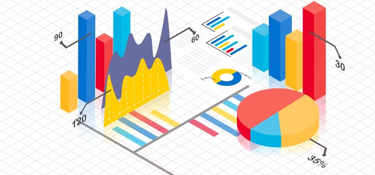
3. Diagrammatic
Data is shown using diagrams and pictures in this manner. It offers a rapid peek at statistical data and is the most visually appealing style of data presentation. Diagrams can be categorized into four categories, including:
- Pictograms: This type of graphic represents data using visuals. For instance, you may design five books to represent the 5,000 volumes that customers purchased within the first week after the book's publication, with each picture representing 1,000 books.
- Cartograms are any sort of map that shows where a person, place, or thing is located. To discover attractions, restaurants, and gift stores in theme parks, for instance, you can use cartograms.
- Bar graphs: These show different quantities in a data set using rectangles of varying widths on an x and y axis. It displays data for variables in your research using rectangles and numerical numbers.
- Data is shown as a fraction in a circle in a pie chart. This shows any kind of numerical data, although it performs best when there are fewer variables.
III. Steps to presenting information effectively
There are several best practices for presenting information effectively:
1. Identify the reader
The first and foremost consideration when presenting information is understanding the reader they are trying to present. It is essential to hone your message and emphasize what is important to each author
2. Tell a story
An image is only as good as the story that goes with it. To get support from stakeholders in your organization, you need to present a factual and understandable story. While a story based on your historical knowledge or intuition may be compelling, it may not garner credibility. Similarly, visualization won’t help if people can’t easily decipher the meaning of the data. Therefore, it is important to present a story that combines both visual and narrative elements to convey a clear and compelling message.
3. Make the story actionable
The goal of presenting information is to ensure that your audience understands what action should be taken based on what they learn from the reading. By questioning and influencing your entire organization to deliver the best possible resources, you can ensure that your writing is.
- Example:
A memo by NASA engineers reporting problems with the O-ring on the space shuttle Challenger, where important information is buried in the middle and launch acceptance information is in the highlights.
This unethical writing leads non-technical managers to believe that the O-ring problem is unimportant. Ethical writing involves presenting information in a way that helps the target audience understand its relative importance and whether a technical fact is good or bad. This chapter was written by authors from Central Oregon Community College and is CC-BY 4.0 licensed, with input from a Humanities/Writing Science Professor.
Conclusion
In summary, presenting information effectively is an essential skill that can be developed by analyzing the presentations of authors following good practices for effective presentation and reviewing case studies. By following these strategies, you can improve your presentation skills and communicate your ideas to others better. Remember to choose the presentation style that best suits your needs, engages your audience, and communicates information clearly and succinctly.