
Lesson 6 – How to Interpret Scientific Charts and Graphs
Introduction
Interpreting scientific charts and graphs is essential for students, researchers, and professionals across various fields. These visual representations condense complex data into accessible formats, allowing quick comprehension of trends, patterns, and relationships. Mastering the interpretation of charts and graphs significantly enhances one’s ability to communicate scientific findings effectively. This lesson will guide you through the essential steps and strategies for interpreting different scientific charts and graphs, drawing insights from educational resources and real-world examples.
I. Definition of Scientific Graphs and Charts
Scientific graphs and charts are visual tools used to represent data and illustrate relationships between variables. They simplify complex information, making observing trends, comparing data points, and identifying patterns easier. Common types of scientific graphs and charts include bar graphs, line graphs, pie charts, and scatter plots, each serving specific purposes based on the nature of the data.
Graphs and charts are ubiquitous in scientific literature because they offer a visual summary of data, making it easier to understand and analyze information at a glance.
Whether it’s a bar graph showing the average rainfall per month, a line graph comparing trends over time, or a pie chart illustrating proportions, each type of graph has unique features that make it suitable for different data representations.
However, interpreting these visuals can lead to correct conclusions. Thus, developing graphical literacy—the ability to read, analyze, and critically evaluate data presented in visual formats—is crucial. This lesson aims to provide the tools and strategies necessary to achieve this.
II. Types of Scientific Graphs and Charts
1. Bar Graphs
Bar graphs are used to compare different categories or groups. Each bar’s height represents the value of the data it corresponds to. For instance, a bar graph showing the average monthly rainfall in the UK can reveal which months are wetter or drier.
Steps to interpret bar graphs
- Identify the title: Understand what the graph is about.
- Read the axis labels: Determine what each axis represents (e.g., months of the year, rainfall in mm).
- Compare bar heights: Identify the tallest and shortest bars to understand the data trends.
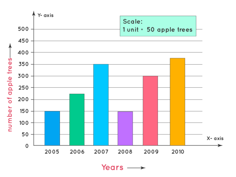
Figure 1: Bar Graph
Example: A bar graph displaying the average monthly rainfall in the UK might show May as the driest month and October as the wettest. This quick comparison helps in understanding seasonal variations in rainfall.
2. Line Graphs
Line graphs are excellent for showing trends over time. They plot data points connected by lines, making it easy to observe changes and trends. For example, a line graph comparing monthly rainfall in the UK and India can show how rainfall patterns differ between the two countries over the year.
Steps to interpret line graphs
- Identify the title and legends: Understand what the graph represents and differentiate between multiple lines if present.
- Examine the axes: The x-axis typically represents time, while the y-axis represents the measured variable.
- Observe the trends: Look at the direction and slope of the lines to understand the trends over time.
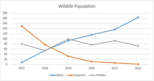
Figure 2: Line Charts
Example: A line graph comparing UK and Indian rainfall might show that India experiences lower rainfall from October to April but much higher rainfall during summer due to the monsoon season.
3. Pie Charts
Pie charts illustrate proportions within a whole. Each slice represents a percentage of the total. They help show the relative sizes of different categories at a glance.
Steps to interpret pie charts
- Read the title: Understand what the pie chart is about.
- Examine the slices: Look at the size of each slice to understand the proportion it represents.
- Check the legend: Identify what each slice represents.
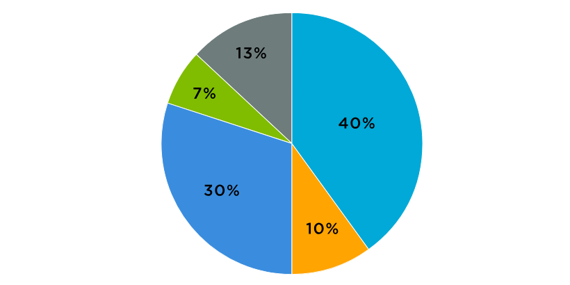
Figure 3: Pie Charts
Example: A pie chart comparing total annual rainfall in the UK and India might show that the UK accounts for 55% of the total rainfall, indicating that, on average, the UK is wetter than India.
4. Scatter Plots
Scatter plots display individual data points on a two-dimensional plane, showing relationships between two variables. They help identify correlations, trends, and outliers.
Steps to interpret scatter plots
- Read the title: Understand the relationship being represented.
- Examine the axes: Determine what each axis represents.
- Look for patterns: Identify clusters, trends, and outliers among the data points.
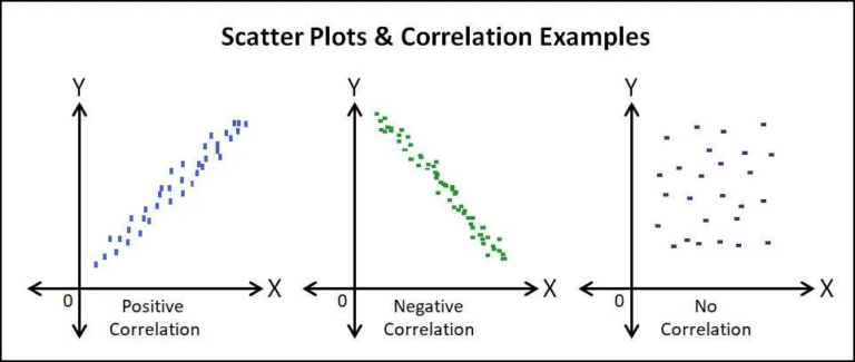
Figure 4: Scatter Plots
Example: A scatter plot might show the relationship between hours studied and exam scores, indicating whether more study hours correlate with higher scores.
III. Steps to Interpret Scientific Graphs and Charts
1. Annotate the Graph
Annotating the graph involves circling key areas, such as the title, axis labels, and legends, and making brief notes. This helps quickly identify the critical components and understand the graph’s context.
2. Steps for annotation
- Circle the title: I t helps to keep the focus on the graph's main subject.
- Label the axes: Ensures clarity on what each axis represents.
- Note the legend: Understand the meaning of different symbols or colors used.
3. Draw Conclusions
Once you understand the graph, write down key conclusions based on the data. This helps in summarizing the main findings.
4. Example conclusions:
- Bar graph: "October is the wettest month in the UK."
- Line graph: "India has a significant increase in rainfall during the summer months."
- Pie chart: "The UK receives more annual rainfall than India."
5. Relate to Paired Text
Often, graphs are accompanied by textual descriptions or paired with other data. Understanding the relationship between the graph and the text is crucial for comprehensive interpretation.
Steps to relate to text:
- Compare the data: See if the graph supports or contradicts the text.
- Make annotations: Use symbols (+, -, /) to indicate if the graph agrees, disagrees, or is neutral to the text.
Example: If a passage discusses the impact of pathogens on honey bee colonies and a table shows higher pathogen occurrences in Colony Collapse Disorder (CCD) affected colonies, you can annotate with a “+” indicating that the data supports the passage.
IV. Common Pitfalls and How to Avoid Them
1. Misreading Labels
Misinterpreting axis labels or legends can lead to incorrect conclusions. Always double-check these elements before analyzing the data.
Tip: Take a moment to carefully read and understand all labels and legends before diving into the data analysis.
2. Overlooking Footnotes
Footnotes often provide crucial context or additional information about the data. Ignoring them can result in a superficial understanding.
Tip: Always read footnotes and consider how they might influence the interpretation of the data.
3. Ignoring Units of Measurement
Different units of measurement can drastically change the meaning of the data. Ensure you understand the units used in the graph.
Tip: Consider units and how they affect the data comparison and conclusions.
4. Cherry-Picking Data
Focusing only on specific parts of the data while ignoring the rest can lead to biased interpretations. Look at the overall picture.
Tip: Analyze the entire graph for a comprehensive understanding rather than focusing on selective data points.
V. Practice Problems
1. Bar Graph Interpretation
Problem: A bar graph shows the average monthly temperature in a city over a year. The x-axis represents the months from January to December, and the y-axis represents the temperature in degrees Celsius.
Questions:
- Which month has the highest average temperature?
- What is the average temperature in March?
- Compare the temperatures in January and July.
2. Line Graph Interpretation
Problem: A line graph shows the population growth of City A and City B over ten years. The x-axis represents the years, and the y-axis represents the population in thousands.
Questions:
- In which year did City A have the highest population?
- How does the population growth of City B compare to City A over the ten years?
- Identify any significant trends or patterns in the population growth of both cities.
3. Pie Chart Interpretation
Problem: A pie chart shows a country’s distribution of different renewable energy sources. The slices represent solar, wind, hydro, and biomass energy.
Questions:
- Which renewable energy source has the largest share?
- What percentage of the total energy is provided by wind energy?
- Compare the shares of hydro and biomass energy.
4. Scatter Plot Interpretation
Problem: A scatter plot shows the relationship between hours studied and exam scores for a group of students. The x-axis represents the hours studied, and the y-axis represents the exam scores.
Questions:
- Is there a positive or negative correlation between hours studied and exam scores?
- Identify any outliers in the data.
- What can you infer about the relationship between study time and exam performance?
VI. FAQs
1. Why is it essential to annotate graphs and charts?
Annotating graphs and charts helps emphasize critical information, ensuring you pay attention to essential details. It makes the process of interpreting and answering related questions more efficient.
2. What are the common types of graphs used in scientific data representation?
The common types of graphs include bar graphs, line graphs, pie charts, and scatter plots. Each type serves different purposes and is suitable for various kinds of data representation.
3. How can misreading labels affect the interpretation of a graph?
Misreading labels can lead to incorrect conclusions, as the labels provide crucial information about what the axes, legends, and data points represent.
4. Why are footnotes important in understanding scientific charts and graphs?
Footnotes provide additional context or explanations essential for accurately interpreting the data. Ignoring them can result in missing critical information.
5. How can I practice interpreting scientific charts and graphs effectively?
Practice by regularly reviewing different graphs from scientif ic articles or practice tests. Annotate them, draw conclusions, and relate them to any accompanying text.
6. What should I do if a graph seems complicated or confusing?
Break it into smaller parts: start with the title, then move to the axes, labels, and legends. Annotate key areas and summarize what each part represents before drawing overall conclusions.
7. How do different units of measurement impact data interpretation?
Different units can significantly alter the perception of data. Understanding the units used to make accurate comparisons and conclusions is essential.
8. What is the best way to relate a graph to its paired text?
Identify the text’s main points and see if the data in the graph supports, contradicts, or is neutral to these points. Use annotations to mark these relationships for easier reference.
9. Can interpreting graphs help in everyday decision-making?
Yes, interpreting graphs and charts can help make informed decisions based on data, whether in professional settings, academic work, or personal life decisions like financial planning.
10. How can I avoid the pitfall of cherry-picking data?
Ensure you consider all parts of the graph and not just selective data points. Look at the overall trends and patterns before concluding.
Conclusion
Mastering scientific charts and graphs interpretation involves careful reading, thoughtful annotation, and critical analysis. By applying the strategies outlined in this lesson, you can enhance your ability to understand and communicate complex data effectively, a crucial skill in academic and professional settings.